View table
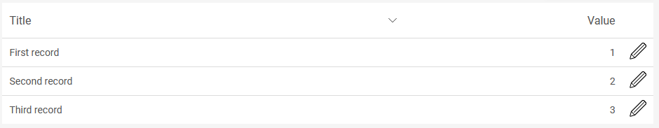
With a view table, data records will be displayed in table format. A table column is created for each data field that is added to the table, and a table row is created for each data record. The sorting of the table can be changed in the browser by clicking on the column header. A view table can display data of the same level, data from superordinate data groups, and data from the immediately subordinate data group (child data group).
General information about data groups in applications can be found here.
The data of a view table can be exported to different formats.
The "View table" element is one of the overviews.
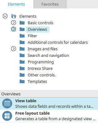
The view table can be found in the "Applications" module in the "Elements" area. A new element can be created by dragging & dropping it from here and positioning it in the workspace.
More information on creating elements can be found here.
The properties dialog of a view table opens automatically when it is newly created.
The properties dialog of an existing view table can be opened by double-clicking on the element in the workspace, via the "Properties" context menu, or via the "Edit / Properties" main menu item when it is selected in the workspace.
Data
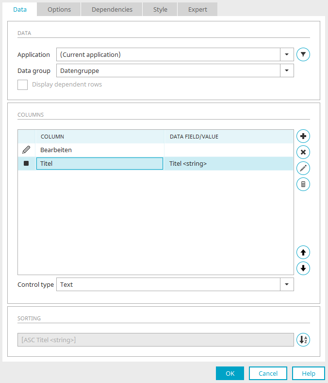
Use the "Data" tab in the properties dialog of a view table to configure the data source and the table columns. It is also possible to specify the sorting of the table.
Application / Data group
Select the data source here.
 Filter
Opens a dialog where a filter can be defined that restricts the data records in the view table.
Display dependent rows
This setting can only be selected if you have chosen a subordinate data group as the data source. This setting will only display the data records that are in a parent-child relationship with the currently selected data record.
Columns
All the titles of the data fields that are integrated as table columns are listed here. Under "Data field/Value" you will find the data type of the respective integrated data fields.
 Add column
Opens a menu with the following options.
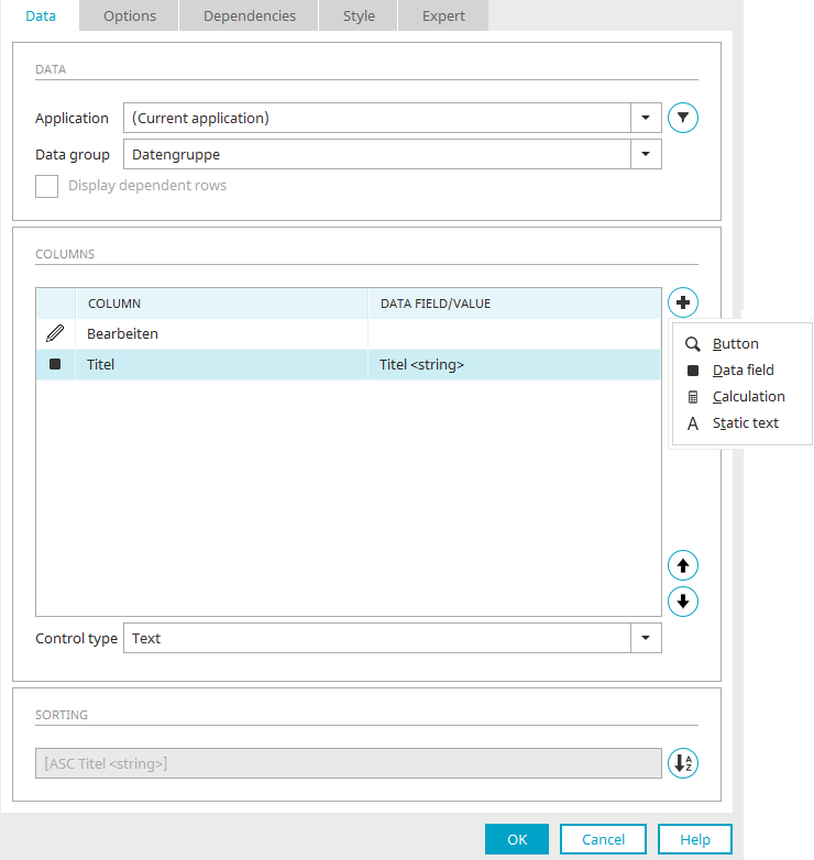
 Button
This menu item allows any number of buttons to be added to each table row. Each button is displayed in its own table column and can open a page where the data are displayed in detail. You can select the desired page in the "Jump target" selection list.
 Data Field
Opens a dialog where the desired data fields can be selected and integrated as a table column.
Select column
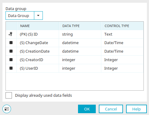
Select the desired data group and then the data field.
Display already used data fields
If this setting is not active, you can only choose from the data fields that are not already in one of the table's columns or included as a control. If this setting is activated, all of the selectable fields will be shown.
Click "OK" to confirm the selection and close the dialog again.
 Calculations
This menu item allows calculations to be performed in an area underneath the view table, such as to show the total amount in a column. Click here for more information.
 Static text
This menu item adds a column where static text can be entered.
 Remove column
Deletes the selected table column from the list.
 Edit column
Depending on which column is currently selected (button, data field, calculation or static text), the corresponding properties dialog will be opened in which you can find the further settings.
You can find further help there by clicking on "Help" at the bottom right of the dialog or by pressing the F1 key.
Edit total calculation
Calculations can also be performed here in an area below the view table. Click here for more information.
With the arrow buttons, the order of the columns can be changed as desired. The higher a field is positioned in the list, the further left the column will be shown in the table.
Control type
If a table column is selected, the possible control types are listed in the "Columns" area. You can define the target destination for buttons.
The "Dynamic view" control type can be used for data fields of the type
-
string
-
text
-
integer
-
double
-
datetime
-
Boolean
(i.e. for all data types except the File data type) if the data field is from the data group that provides the data for the view table.
The control type "Multiple selection" or "Multiple selection 2.0" must be selected for data fields of the type
-
string
-
text
-
integer
-
double
-
datetime
-
Boolean
(i.e. for all data types except the File data type) if the data field is from a child data group of the data group that provides the data for the view table. For child data fields of the file data type, the control type "Multiple selection" or "Multiple selection 2.0" can be selected, but it is not mandatory.
Sorting
 Sorting
Opens a dialog where the table's sorting can be defined.
Click "OK" to complete the view table configuration. It is then created in the workspace. There you can open the properties dialog with a double click on the element if you want to edit the settings.
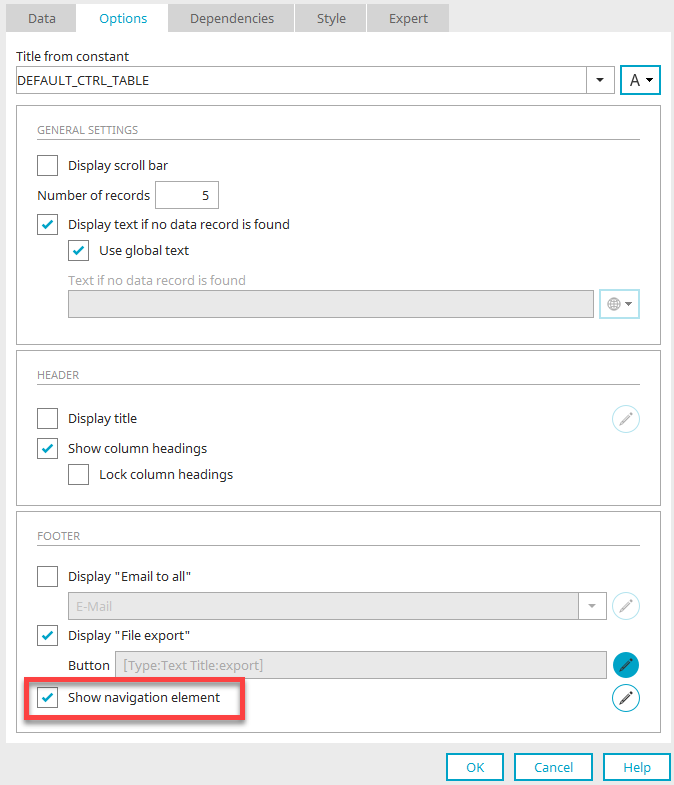
Options
Title
Enter the title for the view table here. Click here for more information about this topic.
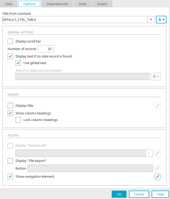
General settings
Display scroll bar
If this setting is activated, a horizontal scroll bar will be shown if the view table is too wide.
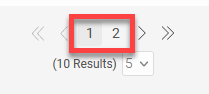
Number of records
Here you set how many records per page should initially be displayed in the table. If this number is exceeded, the navigation element which can be used to scroll to the other table pages is automatically displayed in the footer of the table. If -1 is entered here, all records will be displayed.
The "Number of records per page" affects the "Maximum number of records per page" setting in the navigation element. You can find the relevant information here.
Display text if no data record is found
If this is selected, a text will be displayed when there is no data available.
-
Use global text
Uses the text defined in the global language constant "DR_NO_RECORD" defined in the portal properties.
-
Text if no data record is found
Here, a static text or a constant can be defined if the "Use global text" setting is not active.
Header
Show title
The table heading will be shown.
Edit
Opens a dialog where the table header can be formatted.
Show column headings
Show column headings
Lock column headings
The column headings stay visible when scrolling.
Footer
Display "email to all"
This option is available only if data fields with the "Email" control type are integrated as a table column.
Select the desired edit field in the drop-down list. In the browser, a link will be shown in the footer of the table, with which an email can be sent to all email addresses in the table column.
Clicking this link will open a window where the user may define separators and how the email addresses should be used, as well as start their default email client.
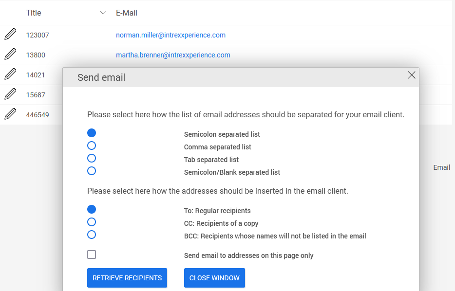
The distribution list that the email will be sent to will be created from the email addresses in the table. No other data from the table will be sent in the email.
Edit
With the setting "Display "Email to all" a click on "Edit" opens a dialog where the properties of the button can be edited.
Display "File export"
Click here for more information on exporting the data contained in the table.
Navigation element
Click here for more information about the navigation element.
Export
The elements
-
View table
Offer the option of exporting the table data if needed. For this purpose, the "Export" button can be displayed below the table.
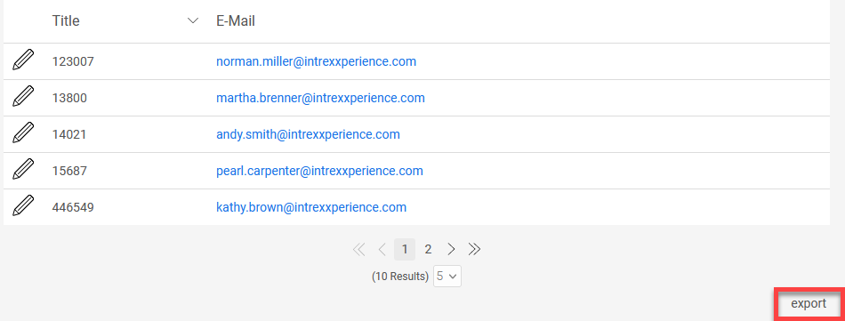
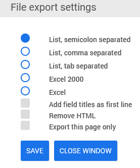
Clicking this button in the browser opens a dialog where different export formats can be selected.
The settings for the export function can be found in the properties dialog of the table on the "Options" tab.
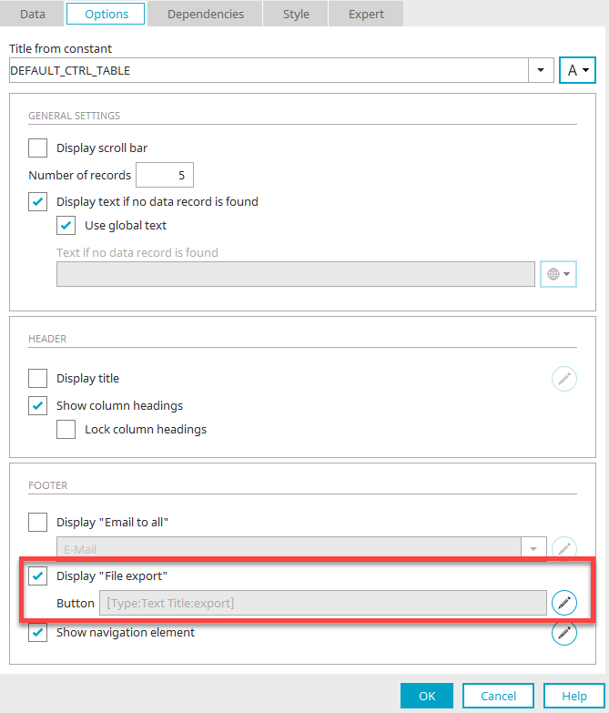
To export, the setting Display "File export" must be activated here. Click on "Edit".
You are then directly in the button properties and can edit the settings of the button. General information on buttons can be found here.
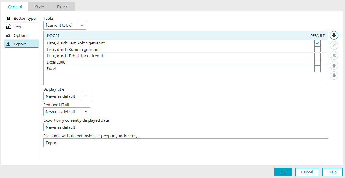
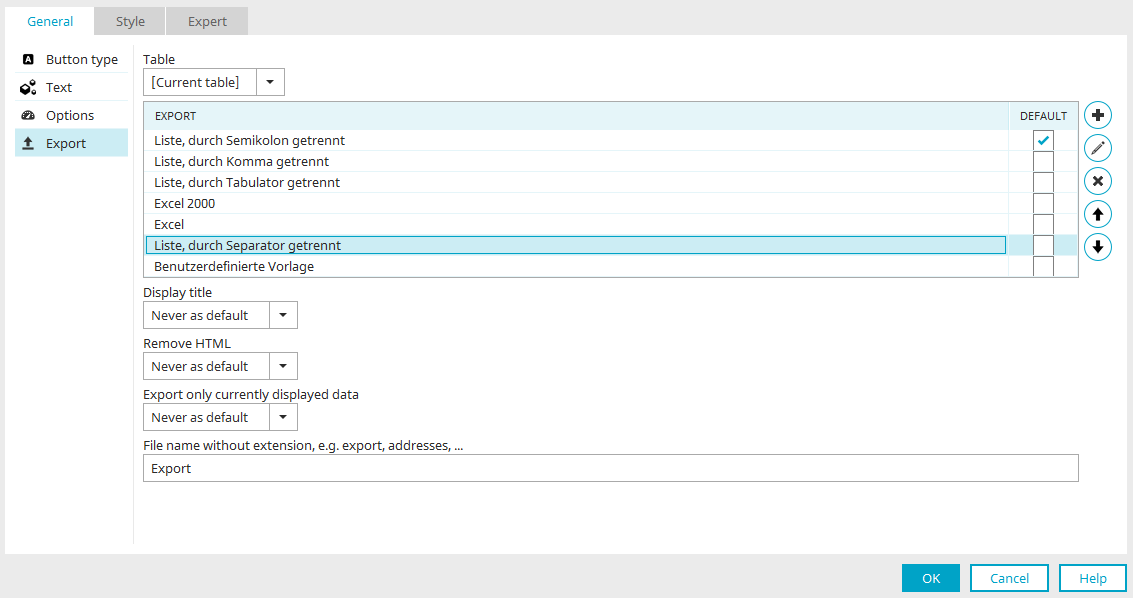
The "Export" item is also located here on the left with the following settings:
Table
The desired table can be selected here. Only tables that are on the current page and display data from the same data group as the current table are selectable.
Upon export, the data records for the corresponding table are exported. For the research element, only the results table of the research can be selected; the selection of other tables on the page is not possible here.
"Export" column
You can see the possible export methods in this column:
-
List, separated by semicolon
-
List, separated by comma
-
List, separated by tab
-
Excel 2000
-
Excel
"Default" column
Use this column to define which export option should be preselected in the browser.
Add template
Displays a menu where the additional export formats "List, separated by separator" and "Custom template" can be selected.
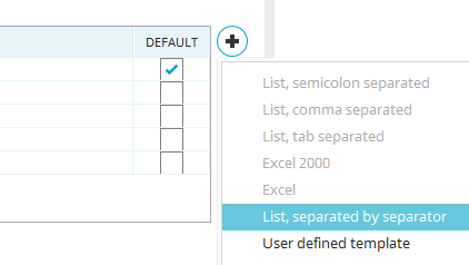
If one of the two formats is selected in the menu, new lines are inserted in the template list for this.
Edit current template
Opens the dialog for editing the template currently selected in the list. In this context, the dialog shows different settings for each template.
Edit template at
-
List, separated by semicolon
-
List, separated by semicolon
-
List, separated by semicolon
-
Excel 2000
-
Excel
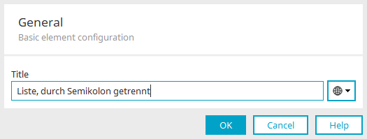
Title
You can change the title of the template here. Click here for more information.
Edit template at
-
List, separated by separator

Apart from the title, the following settings are found here:
Separator
Predefined
A separator that should be used for the exported data can be specified here. In addition to the selectable, predefined line breaks, any of your own separators can also be entered directly into the combobox field.
Ask user
Alternatively, the separator can be determined by the user in the browser.
Edit template at
-
Custom template
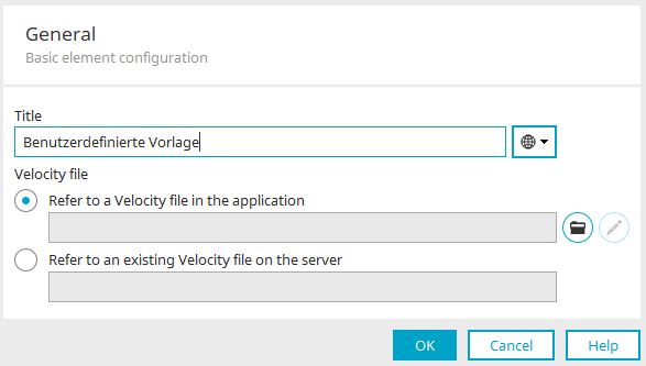
Apart from the title, the following settings are found here:
Velocity file
A Velocity file can be selected here that creates the export. You can find more information here.
Click "OK" to save changes and close the dialog again.
Remove template
The currently selected template is removed from the list.
Move template up / down
Modify the order of the templates.
Show title
Here, you can decide whether the titles of the fields should be added to the export file as the first row.
-
Never
The titles will not be exported.
-
Never as default
In the export popup, the user has the option of activating the export of the titles.
-
Always
The titles will be included in the export file.
-
Always as default
The setting "Add field titles as first line" is already activated in the browser.
Remove HTML
HTML formatting will be removed from the text. The options "Never", "Never as default", "Always", and "Always as default" are also available here.
Only export currently displayed data
Presets whether all data records or only the data records shown in the table will be exported. The options "Never", "Never as default", "Always", and "Always as default" are also available here.
File name without extension, e.g. export, addresses, ...
A name can be predefined for the export file. Do not write a file extension here, as this will be added automatically to the file based on the export format.
Properties that define the appearance of the button can be found in the button's properties dialog, under "General". Buttons can also be presented as text links and images in the browser.
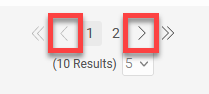
Navigation element
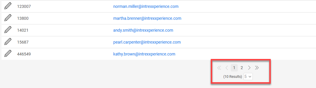
The navigation element is useful for tables with larger amounts of data. It is displayed below the table and makes it possible to flexibly divide the data into different table pages and scroll through the pages.
The "Options" tab contains the "Show navigation element" setting. You can also disable the display of the navigation element here.
Click "Edit" to open the settings of the navigation element.
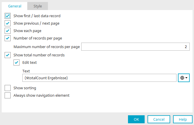
Here you can show or hide the following functions of the element.
Show first / last data record
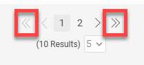
Show previous / next page
Show each page
Number of records per page
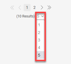
Number of records per page
Set here how many data records per table page are specified in the navigation element. It is then not possible to select a higher value in the browser than the one entered here. If you select the value "-1" as a maximum number, the highest value that can be selected in the browser will correspond to the total number of data records.
The "Number of data records per page" that can be set in the options is the largest number offered for selection in the navigation element - with one exception:
If the initial number is greater than the largest number in the navigation element, then the initial number is used as the largest number in the navigation element. Switching back to the initial view would otherwise not be possible if the record count was switched in the browser.
Show total number of records
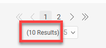
The sum of all data records that are contained in the table (including pages that are not visible) will be shown.
Edit text
By default, the sum of the data records is determined automatically by the "$totalCount" function. If required, you can enter a text of your choice or use a constant that provides the text.
Show sorting
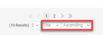
Makes it possible to select the data field according to which the table will be sorted in ascending or descending order.
Always show navigation element
If this property is not set, the navigation element will only be shown if the number of table records per page is greater than the value defined on the "Options" tab in the table properties.
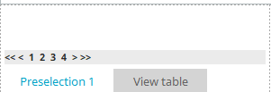
Preselection
Preselections are used to group data. A preselection can be created from the context menu of the view table or via the Edit menu / Preselection / Create preselection when the table is selected on the workspace.
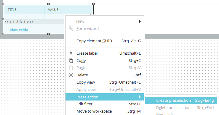
You can use the tabs in the footer of the table to switch between Table and Preselection.
Double-click on the preselection to open the properties dialog. This corresponds exactly to the properties dialog of the view table. A data field can be selected there for the preselection according to which the data records of the table will be grouped.
A "Distinct" query is issued in the database, which is used to filter the data records. You can define as many preselections as you would like for a table. The order of the preselections can be adjusted via the "Edit menu / Preselection / Move left or Move right" respectively.
Preselections cannot be created for view tables that are connected to OData data groups. The SQL keyword "distinct" cannot be used by OData. In this case, selecting data records must be solved by using filters or dependencies.
Calculations
Calculations can be performed in view tables in two ways:
1. In a table row
2. As a summary calculation
You can find instructions on how to do this here.
Summary calculation
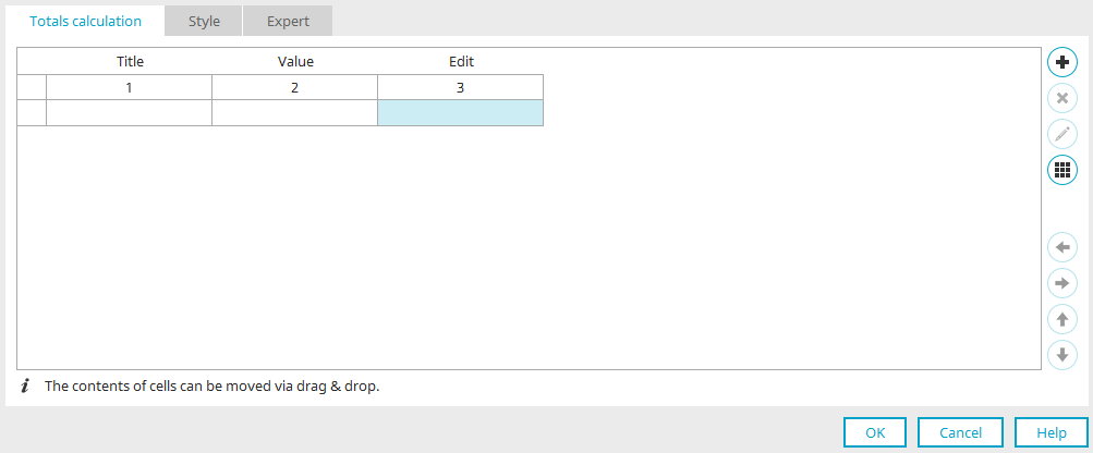
You can access this dialog via the properties of a view table / "Data" tab / click on "Process total range for calculation".
Here you can configure the cells of the summary calculation of a table. Only the columns that are visible in the table (i.e. that are not hidden) can be used in the calculation. Under each column name, you will see a corresponding number. This number represents the index used in the calculation for a table column.
Please note that for actions such as adding, moving, or deleting table columns, that only the index of the visible columns is adjusted in the area of the total amount. The contents of a column are not automatically moved, but they may be deleted, depending on the action. Adjustments to the content must be performed by the users themselves. Columns are always added or deleted at the end of the total amount area.
Add control
Opens a menu where you can select whether you would like to add a "Static text" or a "Calculation".
Delete control
The currently selected control is removed. Place controls for the calculation in the free cell underneath the column index of the column that needs to be calculated.
Edit control
If a calculation is currently selected, a dialog will open where the calculation can be edited.
"Summary" tab
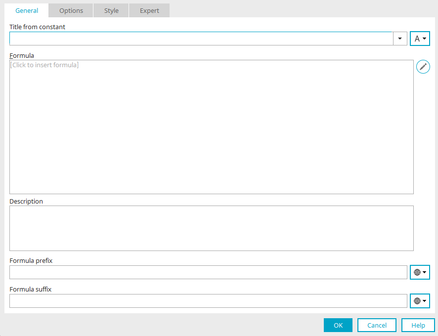
Title
Provide the calculation with a title. Click here for more information.
Formula
The finished formula is displayed here.
Edit formula
Opens the formula editor.
Description
Description Underneath the formula, a description can be entered that is also shown in the "Description" for applications.
Text before the formula / Text after the formula
In these fields, text can be entered that is displayed on the application page in front of and behind the formula, respectively. Constants can also be implemented here.
Click "OK" to save the changes and close the dialog again.
 Edit table
Opens a menu with the following functions:
-
Insert row
-
Delete line
-
Merge cells
-
Divide cells
-
Select user-defined background color
Move columns and cells with controls to the left or right, respectively.
Move rows up or down, respectively.
Move content via drag & drop
Cell contents can also be moved to empty cells via drag & drop. However, in contrast to moving via the arrow buttons, only the contents of the cells will be moved, not the properties of the cells.
Calculation in a table column
Calculations in a table column can be configured via the properties of a View table / "Data" tab / click on "Add column" / "Calculation". A new table column is then created, whose properties you can edit and thus access the dialog for creating the formula, as in the summary calculation.
You can find detailed instructions on how to do this here.
API for tables
API for tables A special API has been developed to be used in Velocity. This API can be used to processed, display and scroll through defined tables (such as from the hidden area). The documentation for the API object is available here.
 Email us