Filter - Operator
The "Operator" element is part of the "Filter" element category.
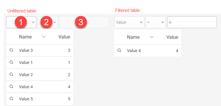
This filter can be used, for example, to compare a view table with an operation, which is connected to the filter via a dependency.
Three fields are available in the filter:
-
Selection of the data field whose values are to be compared
-
Value for which the table is being filtered
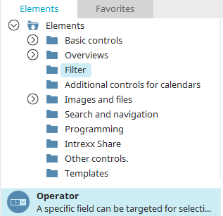
The "Operator" filter can be found in the "Elements" section of the "Applications" module. A new filter can be created by dragging and dropping the element from here and positioning it on the workspace.
All the information for creating elements can be found here.
The properties dialog of the filter opens automatically when a new filter is created. The properties dialog of an existing filter can be opened by double clicking on the element on the workspace, via the "Properties" context menu, or via the "Edit/Properties" main menu if the filter is selected on the workspace.
"Operator" properties filter
General
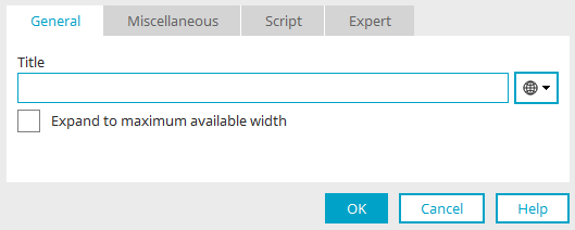
Provide the filter with a title here. Click here for information on multilingual titles.
"Adapt to maximum available width" causes the element to be adapted in width to the next element surrounding it.
Comparison
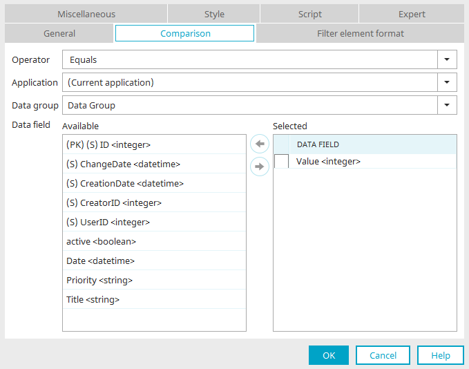
Operator
Select the comparison type here.
Application / Data group
Select the application and data group that contains the data that should be compared with the data of the element to be filtered.
Data Field
Here, the data fields are defined that will be shown in the first drop-down list in the browser.
Available
This list displays all of the data fields that can be selected for the filter.
Selected
This list displays all of the data fields used in the filter.
The checkbox to the left of a data field selected here can be marked if the setting "Show list with data fields" is set on the "Miscellaneous" tab. If the checkbox is active, the data field will be preselected in the browser.
 Move an entry from one list to the other.
Format of the filter element
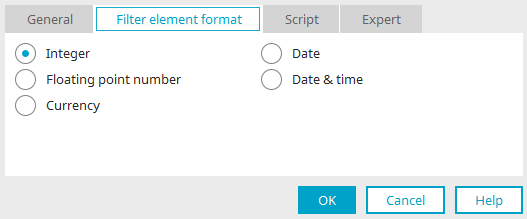
Select the control type of your choice for the display in the browser.
The format should match the data type of the data field being filtered in the dependent element.
The filter only accepts values in the browser that correspond to the format selected here.
If the format is a date format, a small calendar will be shown below the control in the browser, from which the date and/or time can be selected conveniently.
Misc
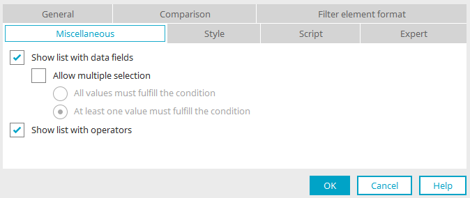
Show list with data fields
This option shows the drop-down list in the browser that the user can select a data field from.
Allow multiple selection
Allows the selection of multiple data fields in the drop-down list in the browser for the comparison.
With this setting, the filter element should be created at the appropriate height so that all entries are visible in the browser.
-
All values must fulfill the condition
With this option, a result will only be found, if the value entered in the filter can be found in all fields selected in the browser.
-
At least one value must fulfill the condition
Returns a result if at least one data field contains the value that was entered as a comparison.
Show list with operators
This option shows the operators list in the browser.
 Email us