In the following table, you will find an overview of all the elements available in applications.
In the "Accessible" column, you will see the following information:
Yes - The element is accessible.
Restricted - The element is accessible if you as a Web author configure it to be accessible.
No - The element is not accessible. If you want to develop an accessible application, you must not use this element.
In the input field below you can enter a term, by which the table will then be filtered.
Label | Accessible | Keyboard | More information |
|---|---|---|---|
Alpha index | Yes | TAB Navigate between filter items | Note that filter controls should be placed within a fieldset grouping so that a meaningful title can be assigned. |
View field | Yes | The element is not interactive. Interaction with the keyboard is not required. | |
View table | Yes | TAB Navigate between table header entries ENTER Sort table columns Arrow keys With a screen reader, you can use the arrow keys to navigate between cells and columns. | For view tables, it is helpful to use the ARIA attribute "aria-label". You can enter a text that describes the content of the table (see |
| Calendar - display selection | No | ||
| Calendar - resource selection | No |
| |
| Drop-down list | Yes | TAB Set focus on the element ENTER Open selection list Arrow keys Navigate between list entries | Can be additionally marked with ROLE attributes and ARIA attributes, for example to describe the state of the list ("aria-expanded"). |
| Tree | No | TAB Navigate to the tree structure ENTER Open next tree level | There are limitations when operating with the keyboard. Layers in the tree structure cannot be closed with the keyboard. |
| Tree view | No | TAB Navigate to the tree structure ENTER Open next tree level | There are limitations when operating with the keyboard. Layers in the tree structure cannot be closed with the keyboard. |
| Calculations | Yes | The element is not interactive. Interaction with the keyboard is not required. | |
| Boolean values | Yes | SPACEBAR Activate and deactivate | Note that filter controls should be placed within a fieldset grouping so that a meaningful title can be assigned. |
| Content view | Yes | The element is not interactive. Interaction with the keyboard is not required. | |
| Content Editor | Yes | CTRL+B to toggle between [strong] CTRL+I to toggle from [emphasis] CTRL+` to toggle [code font] CTRL+SHIFT+0 to make the current text block a paragraph CTRL+SHIFT+1 to CTRL+SHIFT+6 for creating a heading for the level of the actual block of text CTRL+SHIFT+BACKSLASH to make the current block of text a code block CTRL+SHIFT+8 to wrap the selection into an ordered list CTRL+SHIFT+9 to include the selection in an enumerated list CTRL+> to enclose the selection in a quotation mark ENTER to split a non-empty block of text in a list item and to split the list item at the same time CTRL+ENTER insert a hard break CTRL+_ to insert a horizontal line BACKSPACE to undo an input rule ALT+ARROW for `joinUp` ALT+ARROW NUMBERS for `joinDown` ESCAPE for `selectParentNode` | The Content Editor must be used in markdown mode. |
| File selection | Yes | TAB | |
| File selection view | Yes | TAB, ENTER | Depending on the selected template, files can be downloaded or opened in the gallery view. |
File sorting | No | The "File sorting" element requires drag-and-drop operation and is therefore not accessible. | |
| Calendar - Date display | No | The element is not interactive. Interaction with the keyboard is not required. | |
| Dynamic view | Yes | The element is not interactive. Interaction with the keyboard is not required. | |
| Edit field | Yes | TAB Set focus on the element | |
| Exchange tree | Yes | ||
| Exchange file selection for attachments | Yes | ||
| Exchange file view for attachments | Yes | ||
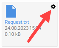
| FileWalker | Restricted | TAB | In the "FileWalker" element, "File Options" are only accessible when you move the mouse over the tile.
To make the FileWalker element completely accessible, you must hide the gear displayed on hovering in the Design module. |
| Filter information | Yes | TAB | Note that filter controls should be placed within a fieldset grouping so that a meaningful title can be assigned. |
| Free layout table | Yes | In a free-layout table, navigation is the same as on a portal or application page. |
|
| Grouping | Yes | The element is not interactive. Interaction with the keyboard is not required. | |
| Calendar plugin | Yes | TAB Jump to the appointment list Arrow keys Navigate between appointments in the list | You can configure the calendar to be accessible. For detailed information, see the section Accessible calendar. |
| Calendar filter | No | ||
| Checkbox | Yes | SPACEBAR Selecting and deselecting the element | |
| View checkbox | Yes | The element is not interactive. Interaction with the keyboard is not required. | |
| Checkbox selection | Yes | SPACEBAR Selecting and deselecting the element TAB Navigate between the checkboxes | Note that filter controls should be placed within a fieldset grouping so that a meaningful title can be assigned. |
| Legend | Yes | The element is not interactive. Interaction with the keyboard is not required. | |
| Line | Yes | The element is not interactive. Interaction with the keyboard is not required. | For the "Line" element, the ARIA role "separator" may be useful. |
| Listbox | Yes | TAB Focus list elements. Arrow keys Navigate between list elements | If you select the value "Unordered List (e.g. list of view elements)" for the HTML element, then you must select the ARIA attribute "aria-labelledby" in the "Accessibility" tab and save the ID of its text field. That ensures the title is read out loud correctly. See also the section Listbox. |
| Multiple selection | No | Use Multiple Selection 2.0. | |
| Multiple Selection 2.0 | Yes | TAB, arrow keys for navigation. ESCAPE Close multiple selection SPACEBAR or ENTER (de)select selection | |
| Multiple Selection view | Yes | The element is not interactive. Interaction with the keyboard is not required. | |
| Multiple Selection 2.0 view | Yes | The element is not interactive. Interaction with the keyboard is not required. | |
| MS365 OneDrive | No | ||
| Navigation (records) | Yes | TAB, ENTER, SPACEBAR Navigate between records | The elements are image buttons and can be customized in the Manager. |
| Operator | Yes | Arrow keys | Note that filter controls should be placed within a fieldset grouping so that a meaningful title can be assigned. |
| Option field | Yes | Arrow keys Switch between options | If you have selected the "Display title as legend element" checkbox in the "General" tab and also created a field title, then you must delete the "for" attribute in the field title in the "Expert" tab. |
| Path navigation for tree | Yes | TAB Navigate through the path navigation | |
| Plugin selection (calendar) | Restricted | The element cannot be operated with the keyboard. | For the "Plugin selection (calendar)" element to be used in a completely accessible way, as the Web author you must preassign plugins so that they can no longer be selected or deselected in the browser by the portal user. |
| Portlet container | — | This element does not represent a single operable element on the user interface. | This element ensures that other pages can be included on a page as portlets. |
| Grids | — | This element does not represent a single operable element on the user interface. | This element ensures that pages are responsive. |
| Research | Restricted | TAB Navigate between table header entries ENTER Sort table columns Arrow keys With a screen reader, you can use the arrow keys to navigate between cells and columns. | Deactivate the research function for the element to be used like a view table. |
| Resource | Restricted | TAB Jump to the appointment list Arrow keys Navigate between appointments in the list | You can configure the "Resource" element, in the same way as the "Calendar" element, to make it accessible. For detailed information, see the section Accessible calendar. |
| Button | Yes | Press ENTER or SPACEBAR button. | If you have selected the "Data Picker" action for the "Button" element, then you may check the "Result from an input length of ..." checkbox under " |
| Slider | Yes | TAB Set focus on the element Arrow keys Change value | Operation with the Chromevox screen reader is not possible. |
| Sortable grouping horizontal | No | The element cannot be operated with the keyboard. | You should not use this element. |
| Sortable grouping vertical | No | The element cannot be operated with the keyboard. | You should not use this element. |
| Sortable list | No | TAB Set focus on the element Arrow keys Navigate between list items | Drag and drop functionality is not available for this element. |
| View sortable list | Restricted | The element is not interactive. Interaction with the keyboard is not required. | |
| Static text | Yes | The element is not interactive. Interaction with the keyboard is not required. | |
| Static text for programming | Yes | As a Web author, you have to implement a suitable navigation with the keyboard. | |
| Search | Yes | SPACEBAR or ENTER Start or trigger search | For the "Search" element, the ARIA role "search" may be appropriate. In the Button Properties on the Actions tab, the checkboxes - "Show search settings" - "Show search tabs" - "Show search suggestions" must be deactivated. |
| Calendar - Appointment series | No | TAB | The calendar icon cannot be controlled with the keyboard. |
| Text area | Yes | In the text field, texts can be entered with the keyboard. The established ways of using the keyboard apply. | Do not activate TinyMCE In the "Text field" element, you can activate the TinyMCE and provide the portal user with the TinyMCE editor. (Refer also to the section Text area / View text area) The TinyMCE is not classified as fully accessible by the INTREXX GmbH, so you should refrain from using it from an accessibility perspective. |
| View text area | Yes | The element is not interactive. Interaction with the keyboard is not required. | |
| Calendar - Forward/Backward | Yes | TAB Set focus on the element ENTER Navigate forward and back | |
| VTL Include | Yes | As a Web author, you have to implement a suitable navigation with the keyboard. | |
| Value selection (drop-down list) | Yes | TAB Set focus on the element Arrow keys Navigate between list items | Note that filter controls should be placed within a fieldset grouping so that a meaningful title can be assigned. |
| Value range | Yes | TAB Set focus on the element | Note that filter controls should be placed within a fieldset grouping so that a meaningful title can be assigned. |
| Value selection (open presentation) | Yes | TAB Set focus on the element Arrow keys Navigate between list items | If possible, select the value "Standard" under "HTML element". If you display the filter as a list, you must not create a field title. Instead, you must assign an aria-label attribute with a title. Note that filter controls should be placed within a fieldset grouping so that a meaningful title can be assigned. |
 (Advanced)". Do not enable "Show characters automatically". (For more information, see the section
 Email us